KazFont - free programmer font for Windows
2. Programming languages compatibility
In the programming languages, many symbols have special meaning.
For example characters & ^ * | ! / %, are mathematical operators and should be distinct from any letter,
and should be aligned with '=' character. Symbol pairs like &&, || and -> have also special meaning.
Especially -> should form an arrow.
Similar characters should be different enough to avoid mistakes.
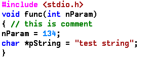
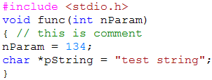
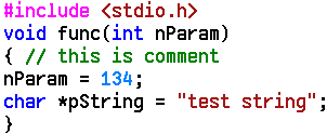
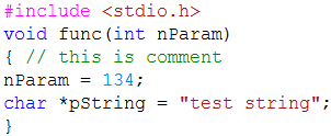
You can verify some example characters (sS5 6b oO0 9g iIl1 8B) on the pictures below.
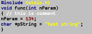
Another topic is syntax coloring. The human eye have trouble to distinguish colors of small objects surrounded by large solid background.
To clearly see syntax coloring, the width of the lines that compose a character, should be larger than one pixel.
Three sizes of KazFont subfonts have 2-pixel lines, so the character colors are easier to identify.
In contrast, TrueType fonts emulate fractional line widths using colored pixels, which makes them look foggy.
As you can see, character height is larger and vertical character spacing is smaller in KazFont compared to Courier New.
This is by design. KazFont has large character size and can display more lines of code on the screen. In the program source code,
we use characters below 128 more often than accented characters, which can appear only in comments and strings.
| KazFont 12 | Courier New 12 |
|---|
 |
 |
 |
 |
| KazFont 13 | Courier New 13 |
 |
 |
 |
 |
At the end, compare visibility of the syntax coloring that I use, whith some default IDE settings.
| KazFont 12 | Courier New 12 |
|---|
 |
 |
| 


